Data Analysis
There is a huge amount of paremeters and measurements that are transmitted via telemetry. After the first autonomous flight, I wanted to know how many solar cells are needed to power the duck. So I converted the logs to CSV and started with some basic visualizations of the transmitted values.
Data structure#
The telemetry protocols are transmitted via topics. For example, the topic mavlink_raw_imu_t describes, that the incoming data package
contains accelerometer, gyroscope and magnetometer data. A list of all topics can be found here.
With this knowledge, I searched for all possibly interesting topics and created a jupyter notebook to visualize the different data streams.
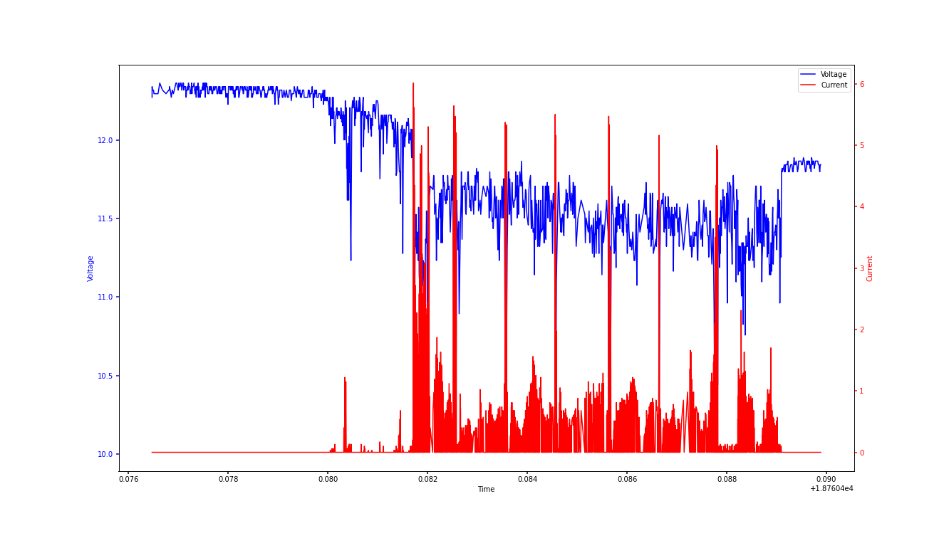
Power consumption#
I was particularly interested in calculating the current consumption of the duck, since I need to know how many cells are needed to charge the lipo. With this data, it is also possible to calculate the percentage of time the duck needs to rest on the lake.
In the following graph you can see the voltage of the lipo and the current over time.
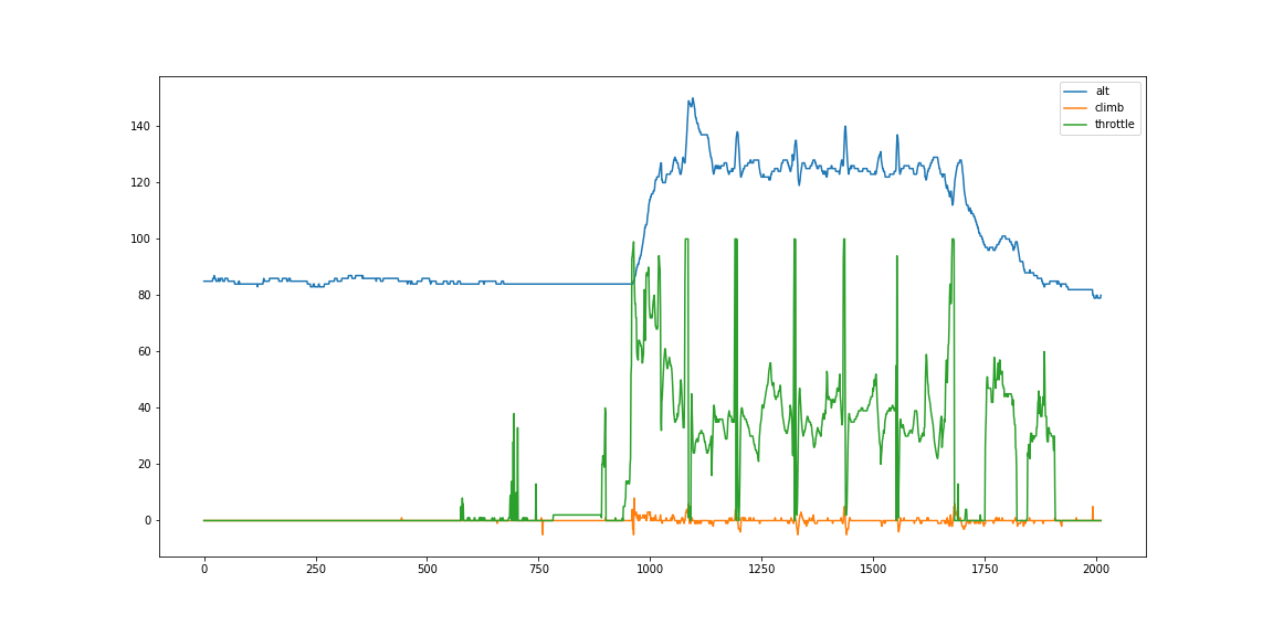
In the next graph you can see that the throttle goes to maximum at each of these peaks and a significant increase in altitude immediately after.
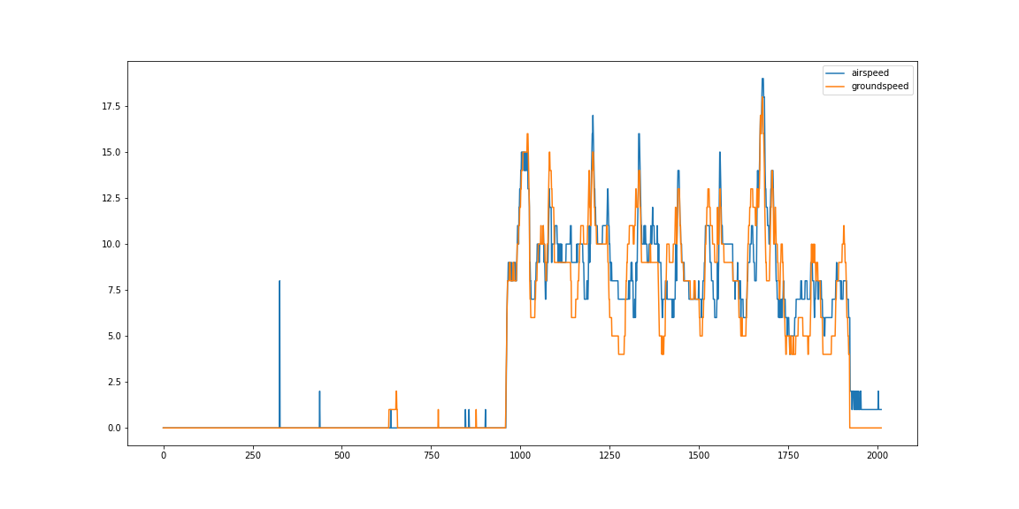
You can see this behaviour also if you take a look at the ground and airspeed.
To read more about the power consumption, please visit the solar built docs.
Aereal data#
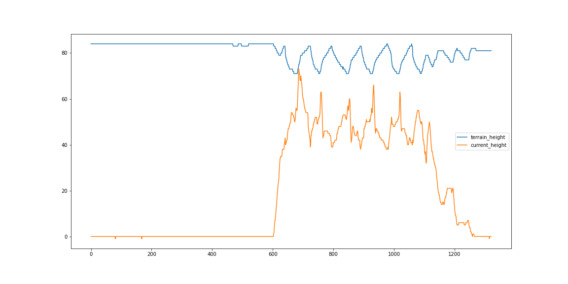
When I scrolled through all availiable topics and measurement I saw that there is also a parameter that is called terrain_height.
If you plot these values combined with the current_height you can see that also the terrain_height can be taken into account on calculating the
path of the plane.
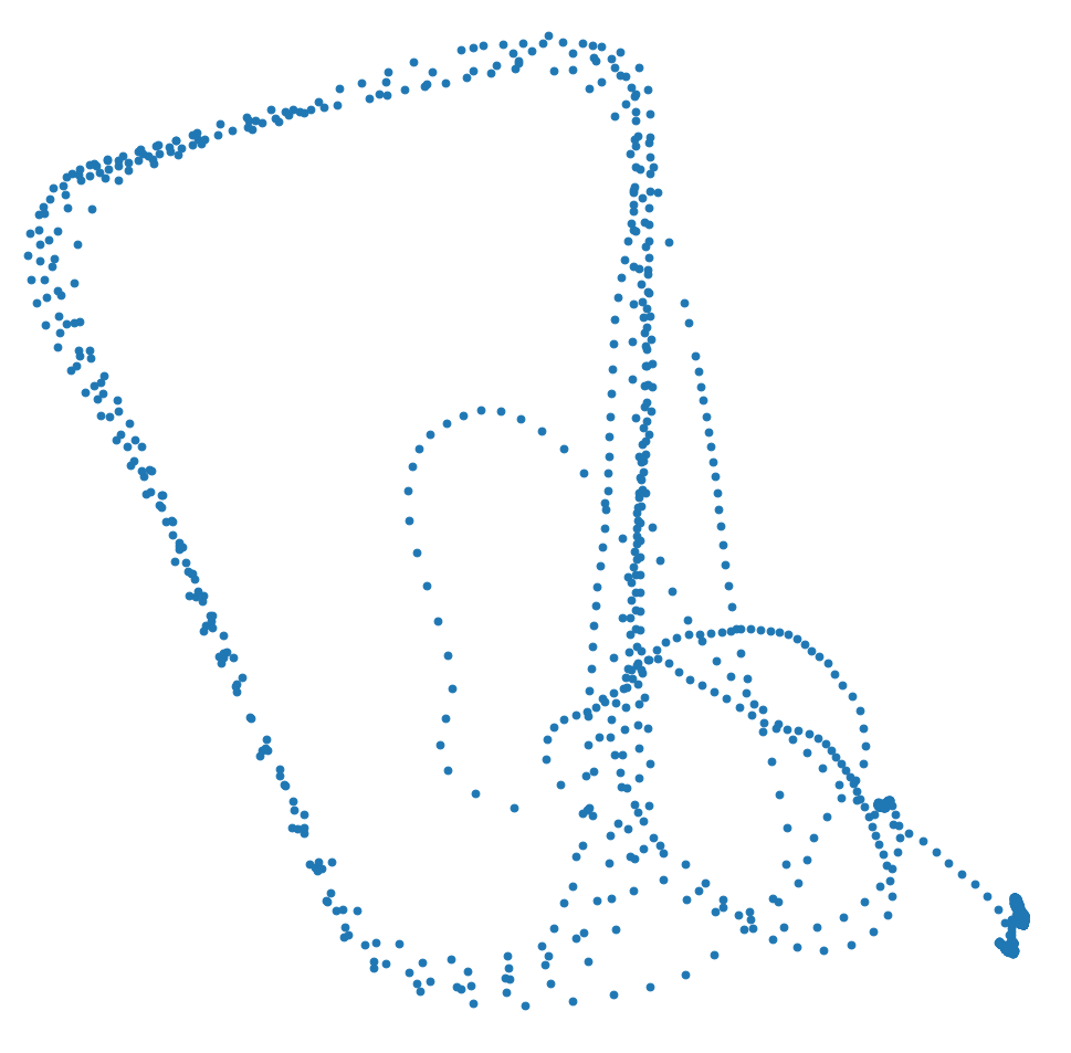
Visualizing the longitude and latitude leads to the following diagram. The small circles are evidence of my lack of ability to control the aircraft and bring it back down.
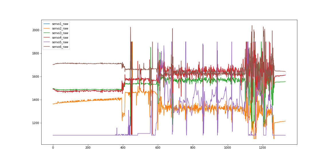
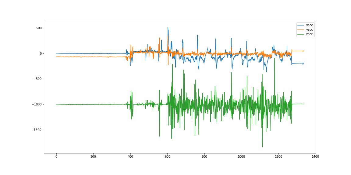
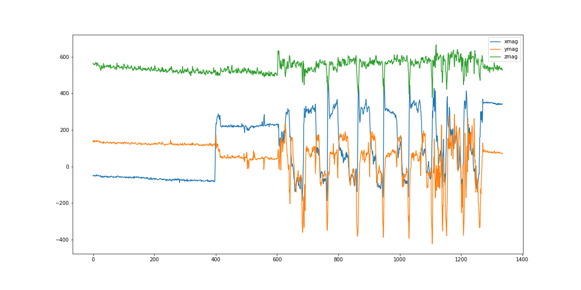
Sensor data#
I don't know if the following plots might be helpful in the future. For now, I'm just adding them because I think they're pretty.
The next diagram illustrates the raw servo outputs. If you compare the brown and red lines, you can see that these outputs are inverted. These must be the outputs of the servos that control the rudders. The purple line must be the throttle.